


What's in a Book Cover?
The public face of a book. Plus, THE BELLES has a book cover! 🤗
The saying goes, “Don’t judge a book by its cover” but covers exist exactly so a potential reader can quickly size it up—in other words, so a potential reader can pass immediate judgement on whether it might be something they want to buy. A book cover is a work of art that’s separate from—yet in conversation with—the story on the page, and though the adage isn’t really about books, I’m sticking with the phrase.
Like so much else in publishing, book covers sit at the nexus of art and commerce. A good cover matters because it’s the first point of interaction a potential reader will have with the story. Imagine you just walked into your local neighborhood bookstore or are scrolling through books online before bed. Unless the author is general audience name-recognition famous (hi, Stephen King! hi, Colleen Hoover!), if you’re casually browsing books rather than seeking a specific title because it was recommended to you by a friend or Reese or your book club picked it, chances are you’re looking at face outs: books on display with their covers facing out, rather than spines out.

Book covers are intentionally eye-catching art, meant to inspire a potential reader to actually buy the book. A good cover increases the likelihood of a reader picking up the book to learn more. At this point, the reader will decide to buy based on one or two things: the jacket copy, maybe the blurbs (the endorsement quotes), and perhaps how gripping the first page. Until that point, however, readers are reacting to the visual stimulus and messaging of the cover. If a reader’s eyes skim past a book because of a lackluster cover design, then they’re not reaching for it, which means they’re not going to read about the “tender, heart-wrenching story of lovers separated across time” (I just made that up) promised by the jacket copy or a blurber—and that means they aren’t going to buy the book.
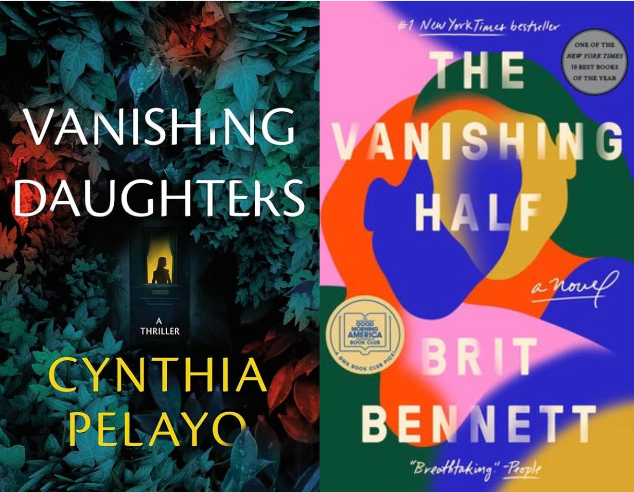
What’s considered “eye-catching” is a business decision because books are ultimately a product on a shelf to be sold. (I’m not here to crush dreams, but I am here to de-romanticize the publishing industry; consider it part of my mission of transparency.) A few years ago, there was a cover trend referred to as the “color blob,” which is exactly as it sounds: amorphous and ambiguous multi-hued blobs. The sales strategy goal, I suppose, was to allow any book buyer to imagine herself reaching for the book. The color blob cover is attention-grabbing, and there’s nothing wrong with any of these covers. But like all trends, it began to show up everywhere, and people grew tired of seeing too much of the same type of cover. It should also not surprise you that this cover trend seemed to find its way onto too many covers by BIPOC writers.
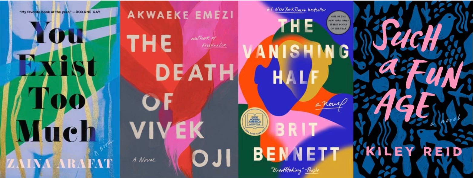
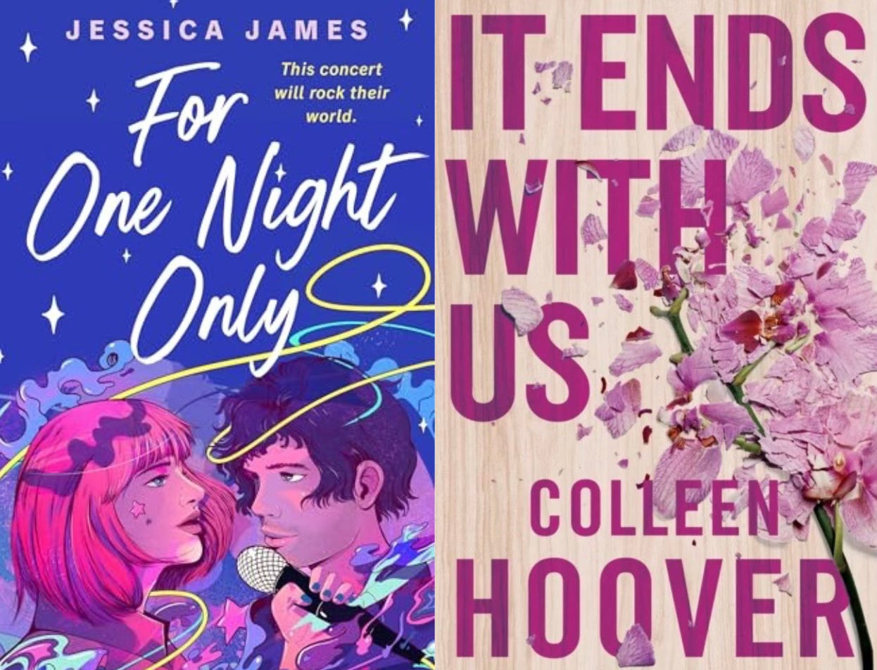
Covers also speak to genre: The bright yummy candy of romance novels. The moody, shadowed covers of horror. A cover is about audience. It’s about speaking to a particular reader. A book can’t be everything to everyone, and a book cover intends to tell you who this story’s ideal reader is, and who the story is for.
How much say an author has in their book covers varies by publisher and author. Some debut authors I know were invited to create mood boards for their design team that included color palettes, images, covers they love and covers they hate. One publisher conducts market research on potential cover options by soliciting feedback on Facebook. Publishers will also dig into the sales history of comparable books during the design process. A book in the same genre that had disappointing sales will inform cover decisions just as much as similar book with massive sales. I imagine that if you’re a Big Name Author, your publisher might be solicitous, though this is only conjecture.
Atria, my publisher, took the reins on my cover. I gave feedback on the initial design, which was tweaked into two versions with minor differences (font, colors). My editor, agent, and I discussed the options, I provided feedback again, the cover was shown around to much internal support, and was finalized into a high-res file that’s now uploaded into almost every possible book database—from Amazon to Goodreads to Target to indie bookstores.
At the end of the day, a cover is a translation of the book’s story and ideas to the market, i.e. the potential readers and buyers of the book. It has to stand out in a bookstore, but it also has to look good when shrunk to thumbnail size on the internet. A book cover is about vibes. What is the feeling? What adjectives does the cover evoke? Is our ideal reader going to select it from the dozens sitting on the same shelf?
My book cover!!
Haunting, evocative, and striking is how I would describe it. A much younger friend brilliantly observed that it reads “coquette” in the language of the Gen Z internet. An older friend said it was reminiscent of The Secret History (very intentional!). What do you think? Leave a comment and let me know!

I really like your cover! But in all honesty, none of the other ones in your post grabbed me (to be fair, these aren't books I'd normally go for).
It's interesting to hear a bit of the inside scoop on how an author works with her publisher on the cover. As a self-published author of one book (from last summer), I struggled mightily with this. I was all over the place in hiring freelance designers and spent way too much money in the process. (I'm doing my next book myself in Canva, it's kind of fun)
I shall keep a look out for your book, I've added it to my Amazon list ☺️